Algorithms and metrics
This section showcases static and temporal graph analysis techniques, including inherited functions
from NetworkX
available for TemporalGraph objects.
The last section includes a practical example on analyzing the temporal
dynamics of a real-world dataset of message exchanges among students.
See also
All examples in this guide are also available as an interactive Jupyter notebook (open in Colab).
Graph properties
The methods
order()
and size()
return the number of nodes and edges in each graph snapshot, respectively,
while an additional argument copies allows specifying whether to count
duplicates:
>>> import networkx_temporal as tx
>>>
>>> TG = tx.temporal_graph(directed=True) # TG = tx.TemporalMultiDiGraph()
>>>
>>>
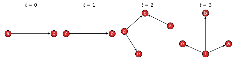
>>> TG.add_edge("a", "b", time=0)
>>> TG.add_edge("c", "b", time=1)
>>> TG.add_edge("c", "b", time=1) # <- parallel edge
>>> TG.add_edge("d", "c", time=2)
>>> TG.add_edge("d", "e", time=2)
>>> TG.add_edge("a", "c", time=2)
>>> TG.add_edge("f", "e", time=3)
>>> TG.add_edge("f", "a", time=3)
>>> TG.add_edge("f", "b", time=3)
>>>
>>> TG = TG.slice(attr="time")
>>> print(TG)
TemporalMultiDiGraph (t=4) with 6 nodes and 9 edges
Note that when printing a TemporalGraph instance, the order of
the graph \(|\mathcal{V}|\) corresponds to the number of unique nodes and its size to the
number of edge interactions \(|\mathcal{E}|\) (with parallel edges):
>>> print("Order:", TG.order())
>>> print("Order (unique nodes):", TG.order(copies=False))
>>> print("Order (including copies):", TG.order(copies=True))

Order: [3, 2, 4, 4]
Order (unique nodes): 6
Order (including copies): 13
>>> print("Size:", TG.size())
>>> print("Size (unique edges):", TG.size(copies=False))
>>> print("Size (including copies):", TG.size(copies=True))

Size: [2, 1, 3, 3]
Size (unique edges): 8
Size (including copies): 9
Visualizing the graph with draw(), however, shows all nodes
and edges, including their copies:
>>> tx.draw(TG, layout="kamada_kawai", figsize=(8,2))
See also
The alias methods:
temporal_order(),
temporal_size(),
total_order(),
and total_size().
Node neighborhoods
Edge directedness is considered when obtaining the neighbors of a node,
either per snapshot or considering all snapshots, via
the neighbors() method
and the neighbors() function, respectively.
Per snapshot
The neighbors()
method returns a generator over graph snapshots, respecting edge direction:
>>> TG = TG.slice(attr="time")
>>> list(TG.neighbors("c"))

[[], ['b'], [], []]
Converting the graph to undirected, we also obtain nodes that have node \(c\) as their neighbor:
>>> list(TG.to_undirected().neighbors("c"))

[[], ['b'], ['a', 'd'], []]
Hint
The above is effectively the same as calling the
all_neighbors()
method instead.
From all snapshots
The neighbors() function
returns node neighborhoods considering all snapshots:
>>> list(tx.neighbors(TG, "c"))

['b']
Converting the graph to undirected, we also obtain temporal nodes that have it as their neighbor:
>>> list(tx.neighbors(TG.to_undirected(), "c"))

['a', 'd', 'b']
Indexes allow to restrict the search to specific snapshots in time, e.g., from \(t=0\) to \(t=1\):
>>> list(tx.neighbors(TG[0:2], "c"))

['b']
Note
Indexing follows Python conventions and is inclusive on the left and exclusive on the right, i.e., the above example returns the neighbors of node \(c\) at time steps \(t=0\) and \(t=1\).
Node centrality
The functions and algorithms implemented by NetworkX can be applied directly on the temporal graph by iterating over snapshots. For instance, to calculate the Katz centrality for each snapshot:
>>> import networkx as nx
>>>
>>> for t, G in enumerate(TG):
>>>     # We convert the multigraph to a simple graph first,
>>>     # as Katz centrality is not implemented for multigraphs.
>>>     G = tx.from_multigraph(G)
>>>     katz = nx.katz_centrality(G)
>>>     katz = {node: round(value, 2) for node, value in katz.items()}
>>>     print(f"t={t}: {katz}")

t=0: {'a': 0.54, 'b': 0.65, 'c': 0.54}
t=1: {'b': 0.74, 'c': 0.67}
t=2: {'a': 0.46, 'c': 0.56, 'd': 0.46, 'e': 0.51}
t=3: {'a': 0.51, 'b': 0.51, 'e': 0.51, 'f': 0.46}
Note that we first converted the multigraph to a simple graph (without parallel edges) using the
from_multigraph() function, as the algorithm implementation
does not support multigraphs.
See also
The Algorithms section of the NetworkX documentation for a list of available functions.
Node degrees
In addition, any NetworkX graph methods
can be called directly from the temporal graph.
For example, the methods
degree()
in_degree()
and
out_degree()
return the results per snapshot:
>>> TG.degree()
>>> # TG.in_degree()
>>> # TG.out_degree()

[DiDegreeView({'a': 1, 'b': 2, 'c': 1}),
 DiDegreeView({'b': 1, 'c': 1}),
 DiDegreeView({'a': 1, 'c': 2, 'd': 2, 'e': 1}),
 DiDegreeView({'a': 1, 'b': 1, 'e': 1, 'f': 3})]
>>> TG.degree("a")
>>> # TG.in_degree("a")
>>> # TG.out_degree("a")

[1, None, 1, 1]
Note that, for \(a\) in \(t=1\) above, a None is returned as the node is not
present in that snapshot.
Degree centrality
The degree() function
returns a dictionary with the sum of node degrees over time:
>>> tx.degree(TG)
>>> # tx.in_degree(TG)
>>> # tx.out_degree(TG)

{'a': 3, 'b': 4, 'c': 4, 'd': 2, 'e': 2, 'f': 3}
>>> tx.degree(TG, "a")
>>> # tx.in_degree(TG, "a")
>>> # tx.out_degree(TG, "a")

3
Alternatively, degree_centrality()
returns the fraction of nodes connected to each of all nodes:
>>> tx.degree_centrality(TG)
>>> # tx.in_degree_centrality(TG)
>>> # tx.out_degree_centrality(TG)

{'a': 0.6, 'b': 0.8, 'c': 0.8, 'd': 0.4, 'e': 0.4, 'f': 0.6}
>>> tx.degree_centrality(TG, "a")
>>> # tx.in_degree_centrality(TG, "a")
>>> # tx.out_degree_centrality(TG, "a")

0.6
See also
The alias methods
temporal_degree(),
temporal_in_degree()
and temporal_out_degree()
all return a dictionary with the sum of node degrees over time,
maintaining its original ordering.
Graph centralization
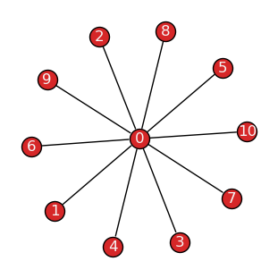
Centralization [1] is a graph-level metric that compares the sum of all node centralities against the maximum possible score for a graph with the same properties, e.g., order, size, and directedness.
For example, the theoretical graph corresponding to the maximum degree centralization is a star-like structure, where one central node is connected to all other nodes in the graph, which are not connected among themselves. This graph is characterized by a degree centralization score of \(1.0\):
>>> G = nx.star_graph(10)
>>> tx.draw(G, layout="fruchterman_reingold")
Degree centralization
The degree_centralization() function returns the score
considering node degrees per snapshot:
>>> tx.degree_centralization(TG)
>>> # tx.in_degree_centralization(TG)
>>> # tx.out_degree_centralization(TG)

[0, 0, 0.3333333333333333, 1.0]
In directed graphs, the in-degree and out-degree centralization scores may differ:
>>> tx.in_degree_centralization(TG) == tx.out_degree_centralization(TG)

False
>>> for t, G in enumerate(TG):
>>>     indc = tx.in_degree_centralization(G)
>>>     outdc = tx.out_degree_centralization(G)
>>>     print(f"t={t}: in={indc:.2f}, out={outdc:.2f}")

t=0: in=1.00, out=0.25
t=1: in=1.00, out=1.00
t=2: in=0.56, out=0.56
t=3: in=0.11, out=1.00
Note that while edge directedness is considered, self-loops and isolates are ignored by default.
This behavior may be changed by passing isolates=True or self_loops=True arguments,
respectively:
>>> G.add_node(-1)    # Disconnected node.
>>> G.add_edge(0, 0)  # Edge self-loop.
>>>
>>> print(f"Default: {tx.degree_centralization(G)}\n"
>>>       f"With isolates: {tx.degree_centralization(G, isolates=True):.3f}\n"
>>>       f"With self-loops: {tx.degree_centralization(G, self_loops=True):.3f}\n"
>>>       f"With both: {tx.degree_centralization(G, isolates=True, self_loops=True):.3f}")

Default: 1.0
With isolates: 0.909
With self-loops: 1.222
With both: 1.109
Centralization metrics
The centralization() function receives the node centrality
values for a static or temporal graph, plus an optional scalar value corresponding to the
maximum possible sum of node centrality differences in a theoretical likewise graph, and returns
the centralization score for the graph.
>>> centrality = G.degree()
>>> scalar = sum(G.order() - 2 for n in range(G.order()-1))  # |V|-1 for DiGraph
>>>
>>> centralization = tx.centralization(centrality=centrality, scalar=scalar)
>>> print(f"Degree centralization: {centralization:.2f}")

Degree centralization: 1.00
The function may be used to calculate the score for other centrality measures, e.g., closeness and betweenness, where the most centralized structure is a star-like graph, or eigenvector centrality, where the most centralized structure is a graph with a single edge (and potentially many isolates).
Temporal dynamics
Let’s take the collegemsg_graph [2]
dataset as an example. It represents message exchanges among students at the University of
California, Irvine, over a period of several months in the year of 2004:
>>> TG = tx.collegemsg_graph()
>>> print(TG)

TemporalMultiDiGraph (t=193) with 1899 nodes and 59835 edges
The dataset is sliced into \(t=193\) daily snapshots, spanning a period from April to October:
>>> TG.names[0], TG.names[-1]

('2004-04-15', '2004-10-26')
Let’s define a custom function to convert date timestamps to week-based intervals
`YYYY, Week W` (0-indexed), and use it to slice the temporal graph into weekly snapshots:
>>> from datetime import datetime
>>>
>>> def strftime(x, fmt="%Y, Week %W"):
>>>    # Convert date to weekly intervals with ascending sorting.
>>>    return datetime.strptime(x, "%Y-%m-%d %H:%M").strftime(fmt)
>>>
>>> TG = tx.collegemsg_graph()
>>> TG = TG.slice(attr="time", apply_func=strftime)
>>> print(TG)

TemporalMultiDiGraph (t=29) with 1899 nodes and 59835 edges
The result is a graph with \(t=29\) snapshots, spanning the weeks of 15 to 43 of 2004:
>>> TG.names[0], TG.names[-1]

('2004, Week 15', '2004, Week 43')
Let’s identify the weeks with the maximum number of nodes and edges:
>>> t_max_order = TG.order().index(max(TG.order()))
>>> t_max_size = TG.size().index(max(TG.size()))
>>>
>>> print(f"Max nodes at t={t_max_order} "
          f"({TG.names[t_max_order]}): V={TG[t_max_order].order()} nodes")
>>> print(f"Max edges at t={t_max_size} "
          f"({TG.names[t_max_size]}): E={TG[t_max_size].size()} edges")

Max nodes at t=6 (2004, Week 21): V=904 nodes
Max edges at t=3 (2004, Week 18): E=10194 edges
Degree distribution
Let’s visualize the node degree distributions on the static graph, considering the whole dataset:
>>> import matplotlib.pyplot as plt
>>> import pandas as pd
>>>
>>> G = TG.to_static()
>>>
>>> fig, ax = plt.subplot_mosaic([["Left", "TopRight"],["Left", "BottomRight"]],
>>>                               constrained_layout=True, figsize=(8, 4), sharex=True,
>>>                               gridspec_kw={"width_ratios": [3, 1]})
>>>
>>> def deg_plot(df, ax, color="#555", title=None, xlabel=None, ylabel=None):
>>>    # Plot degree distribution as a line plot with log-scaled x-axis.
>>>    df.value_counts().sort_index().plot.line(
>>>       ax=ax, color=color, logx=True, marker="x", markersize=3, linewidth=.9)
>>>    ax.grid(color="#ccc", linestyle=":", linewidth=1, alpha=1.0, which="major")
>>>    ax.grid(color="#ccc", linestyle=":", linewidth=1, alpha=0.5, which="minor")
>>>    ax.set_title(title, fontsize=10)
>>>    ax.set_xlabel(xlabel)
>>>    ax.set_ylabel(ylabel)
>>>
>>> def ins_plot(df, ax, bins, axes, title="", xlabel="", ylabel="", color="#555"):
>>>    # Plot histogram of degree distribution with log-scaled y-axis.
>>>    ins = ax.inset_axes(axes)
>>>    hist = pd.cut(df, bins=bins)
>>>    hist.value_counts().sort_index().plot.bar(ax=ins, logy=True, color=color, width=0.7)
>>>    ins.grid(color="#ccc", linestyle=":", linewidth=1, alpha=1.0, which="major", axis="y")
>>>    ins.tick_params(axis='both', which="major", labelsize=9)
>>>    ins.set_title(title, fontsize=9)
>>>    ins.set_xlabel(xlabel, fontsize=9)
>>>    ins.set_xticklabels([f"<{b}" for b in bins[1:]])
>>>    ins.set_ylabel(ylabel, fontsize=9)
>>>    ins.set_yticks([], minor=True)
>>>    ins.set_yticks([1, 10, 100, 1000])
>>>
>>> df = pd.Series(dict(G.degree()))
>>> df_in = pd.Series(dict(G.in_degree()))
>>> df_out = pd.Series(dict(G.out_degree()))
>>>
>>> deg_plot(df, ax["Left"], xlabel="Degree (log-scaled)", ylabel="Frequency")
>>> deg_plot(df_in, ax["TopRight"], title="In-Degree (log)", color="#333")
>>> deg_plot(df_out, ax["BottomRight"], xlabel="Out-Degree (log)", color="#777")
>>>
>>> bins = [0, 10, 50, 100, 500, 1000, 2000]
>>>
>>> ins_plot(df, ax['Left'], bins, axes=[0.67, 0.59, 0.3, 0.32],
>>>          title="Degree Histogram", xlabel="Degree", ylabel="Frequency (log)")
>>> ins_plot(df_in, ax['TopRight'], bins, axes=[0.5, 0.48, 0.45, 0.45], color="#333")
>>> ins_plot(df_out, ax['BottomRight'], bins, axes=[0.5, 0.48, 0.45, 0.45], color="#777")
>>>
>>> plt.suptitle("Node Degree Distributions on Static Graph", fontsize=11, y=1, fontweight="bold")
>>> plt.show()
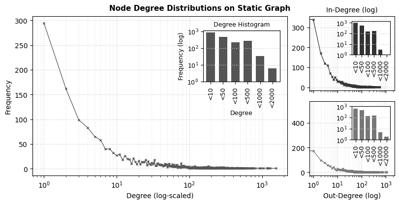
We see the characteristic long-tailed node degree distributions from communication networks, very often observed in online contexts: in general, students form a limited number of connections with their peers, as their frequency seemingly decreases relative to their total degrees.
General statistics
Let’s take a glance at the weekly activity among students using Pandas to describe it:
>>> import pandas as pd
>>>
>>> df = pd.DataFrame({
>>>    "nodes": TG.order(),
>>>    "edges": TG.size(),
>>>    "deg_mean": [sum(d[1] for d in deg)/len(deg) for deg in TG.degree()],
>>>    # "deg_in_min": [min(d[1] for d in deg) for deg in TG.in_degree()],
>>>    # "deg_out_min": [min(d[1] for d in deg) for deg in TG.out_degree()],
>>>    "deg_in_max": [max(d[1] for d in deg) for deg in TG.in_degree()],
>>>    "deg_out_max": [max(d[1] for d in deg) for deg in TG.out_degree()],
>>>    "cent_in": tx.in_degree_centralization(TG),
>>>    "cent_out": tx.out_degree_centralization(TG)},
>>>    index=TG.names)
>>>
>>>  print(df.describe().iloc[1:].round(2))

        nodes     edges  deg_mean  deg_in_max  deg_out_max  cent_in  cent_out
 mean  311.45   2063.28      8.66       67.62       105.38     0.06      0.15
 std   258.45   3071.82      6.68       55.98       100.95     0.04      0.08
 min     4.00      2.00      1.00        1.00         1.00     0.02      0.05
 25%   145.00    385.00      5.08       28.00        37.00     0.04      0.09
 50%   197.00    648.00      6.13       45.00        87.00     0.06      0.14
 75%   342.00   1431.00      8.40       94.00       137.00     0.08      0.18
 max   904.00  10194.00     25.74      192.00       493.00     0.22      0.43
Although the order and size of the snapshots vary significantly, the degree centralization remains relatively stable (\(\sigma = 0.04\) and \(0.08\) for in- and out-degree centralization, respectively).
Temporal activity
Let’s plot this information over time to better understand the students’ activity patterns:
>>> # Include date in x-axis labels for better readability.
>>> def to_date(x):
>>>     if not x.get_text():
>>>         return ""
>>>     return datetime.strptime(f"{x.get_text()} 0", "%Y, Week %W %w")\
>>>                    .strftime("Week %W\n(%b %d, %Y)")
>>>
>>> fig, axs = plt.subplots(figsize=(6, 6), nrows=3, ncols=1,
>>>                         constrained_layout=True, sharex=True)
>>>
>>> plt.suptitle("CollegMsg graph (%s weeks, %s nodes, %s edges)" %
>>>              (len(TG), TG.order(copies=False), TG.size(copies=True)))
>>>
>>> df[["nodes", "edges"]].plot(ax=axs[0], color=["#1f77b4cc", "#ff7f0ecc"])
>>> df[["deg_in_max", "deg_out_max"]].plot(ax=axs[1], color=["#2ca02ccc", "#d62728cc"])
>>> df[["cent_in", "cent_out"]].plot(ax=axs[2], color=["#8e508ecc", "#c8c107cc"])
>>>
>>> axs[0].legend(labels=["Total nodes", "Total edges"])
>>> axs[1].legend(labels=["Max. node in-degree", "Max. node out-degree"])
>>> axs[2].legend(labels=["In-degree centralization", "Out-degree centralization"])
>>>
>>> for i, ax in enumerate(axs):
>>>     ax.set_xlim((0, df.shape[0]-1))
>>>     ax.set_ylim((0, ax.get_ylim()[1]))
>>>     ax.xaxis.set_minor_locator(MultipleLocator(1))
>>>     ax.yaxis.set_minor_locator(AutoMinorLocator(2))
>>>     ax.grid(color="#ccc", linestyle=":", linewidth=1, alpha=1.0, which='major')
>>>     ax.grid(color="#ccc", linestyle=":", linewidth=1, alpha=0.5, which='minor')
>>>
>>> ax.set_xticklabels([to_date(x) for x in ax.get_xticklabels()], rotation=10)
>>>
>>> plt.show()

The chart show the evolution of the network over time in terms of nodes, edges, degrees, and centralization. The first observed weeks show an increased number of nodes and edges and nodes with higher in- and out-degrees. However, the degree centralization in the same intervals remains relatively stable, hinting that the overall communication structure may remain relatively similar.
Temporal evolution
The previous plots, however, tell little about the number of new students and newly formed connections at each time step. Let’s instead visualize those metrics by plotting the intersection and similarity of node sets between snapshots. Since sets are umbalanced in size, let’s compare their intersection against Dice coefficient (double their intersection over the sum of their elements):
>>> def plot_heatmap(data, ax, title, cmap="turbo", vmin=0, vmax=1):
>>>     im = ax.imshow(data, cmap=cmap, vmin=vmin, vmax=vmax)
>>>     ax.spines[:].set_visible(False)
>>>     ax.set_title(title)
>>>     ax.set_xticks(range(0, len(TG), 4))
>>>     ax.set_yticks(range(0, len(TG), 4))
>>>     ax.set_xticks([i-0.5 for i in range(len(TG))], minor=True)
>>>     ax.set_yticks([i-0.5 for i in range(len(TG))], minor=True)
>>>     ax.set_xticklabels([TG.names[i] for i in ax.get_xticks()], rotation=90)
>>>     ax.set_yticklabels([TG.names[i] for i in ax.get_yticks()])
>>>     ax.tick_params(which="minor", bottom=False, left=False)
>>>     ax.grid(which="minor", color="w", linestyle='dotted', linewidth=0.5)
>>>     x0, y0, x1, y1 = ax.get_position().bounds
>>>     cbar = ax.figure.colorbar(im, ax=ax, fraction=0.046, pad=0.04)
>>>     cbar.ax.set_position([x1 + 0.01, y0, 0.02, y1 - y0])
>>>     return cbar
>>>
>>> fig, axs = plt.subplots(figsize=(8, 4), ncols=2)
>>>
>>> intersect = tx.temporal_node_matrix(TG, method="intersect")
>>> jaccard = tx.temporal_node_matrix(TG, method="dice")
>>>
>>> plot_heatmap(intersect, axs[0], "Node set intersection")
>>> plot_heatmap(jaccard, axs[1], "Node set similarity (Dice)")
>>>
>>> plt.subplots_adjust(wspace=0.8)
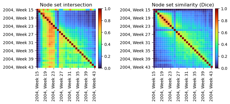
From the temporal node intersections (left), we see most students observed between weeks 17 and 23 remained active throughout the entire period in which data was collected. However, when considering longer time spans, the similarity among node sets decreases significantly (right). There is also an anomalous period where very few nodes intersect with any other intervals (Week 25).
>>> fig, axs = plt.subplots(figsize=(8, 4), ncols=2)
>>>
>>> intersect = tx.temporal_edge_matrix(TG.to_undirected(), method="intersect")
>>> dice = tx.temporal_edge_matrix(TG.to_undirected(), method="dice")
>>>
>>> plot_heatmap(intersect, axs[0], "Edge set intersection")
>>> plot_heatmap(dice, axs[1], "Edge set similarity (Dice)")
>>>
>>> plt.subplots_adjust(wspace=0.8)
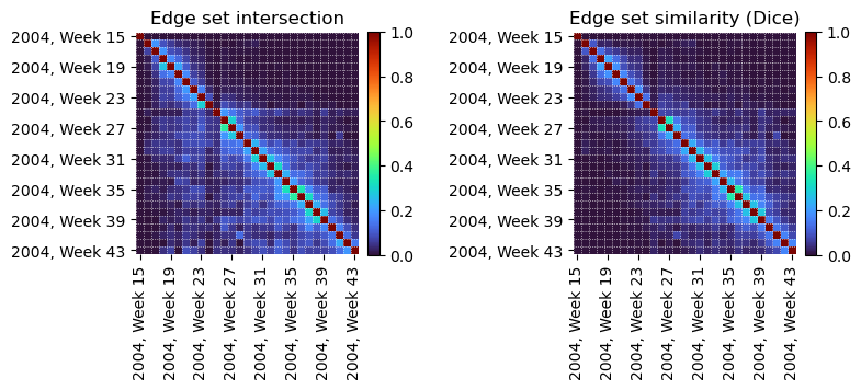
Edge set intersections (left) show instead that most message exchanges were short-lived, with few edges persisting for more than a couple of weeks. The edge set similarity (right) also reflects this trend, with most intervals sharing few edges in common, except for sequential weekly intervals.
This initial exploration offers insight into the temporal dynamics of the network. Further analysis may seek to explore specific intervals of interest, e.g., the anomalous period in Week 25, identify the most active students, or detect communities to explore the evolution of social groups in time.